One Page, One Story
This is a story of how a landing page was designed to guide intuitively and inform with confidence.
Role: Information Designer
Project Length: 2 weeks
Project Overview
This is the short version. Scroll down for the full process.
-
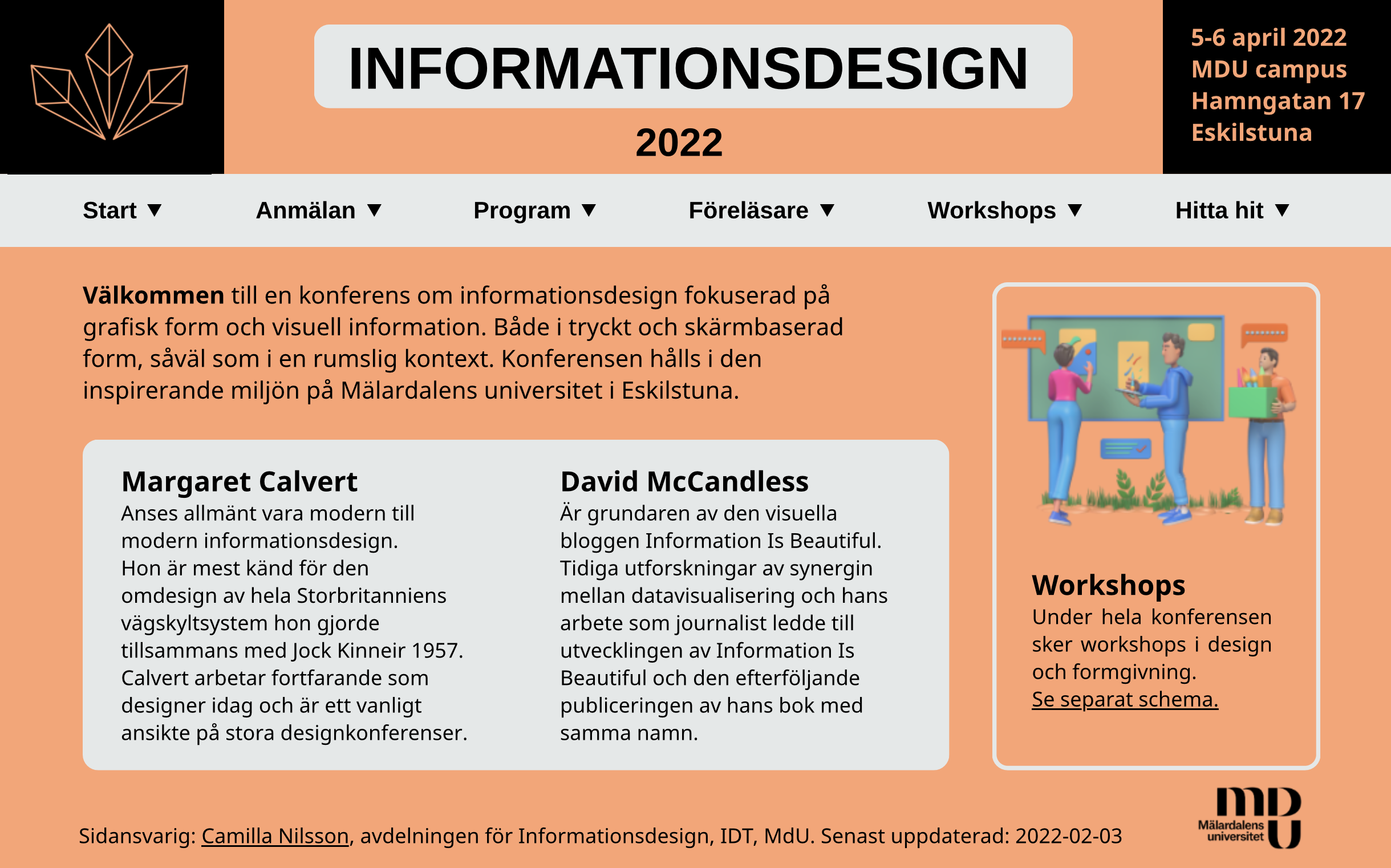
Design a static landing page for a fictional conference. No scroll. Fixed dimensions. All texts provided.
The goal: Deliver information clearly and within strict constraints.
-
Working within a small frame and predefined content, the challenge became one of visual hierarchy, spatial balance, and maintaining user focus.
-
The project moved from sketches to wireframes, through user testing and A/B comparisons. Each iteration informed layout and content prioritization, culminating in a Webflow prototype.
-
The final design was a landing page that delivered clarity and flow with confidence.
Careful use of hierarchy, contrast, and visual rhythm ensured that information was easy to scan while naturally guiding the users through the content.
-
The final design achieved clarity, flow, and visual coherence. It supports stronger user engagement and conversion by minimizing friction and guiding attention effectively.
-
This project highlighted how structure, contrast, and spatial rhythm can drive usability and tone. Even when content cannot be edited.
It also reinforced the value of moving efficiently through testing and feedback. Not by rushing, but by letting user insights guide decisions with focus and clarity.
Chapter 2 - The Process
Sketching and User Testing
I started drawing, not deciding. Ten quick layouts, of which four stood out. Not for being polished, but for having potential.
Real feedback shaped real decisions. I listened more than I explained.
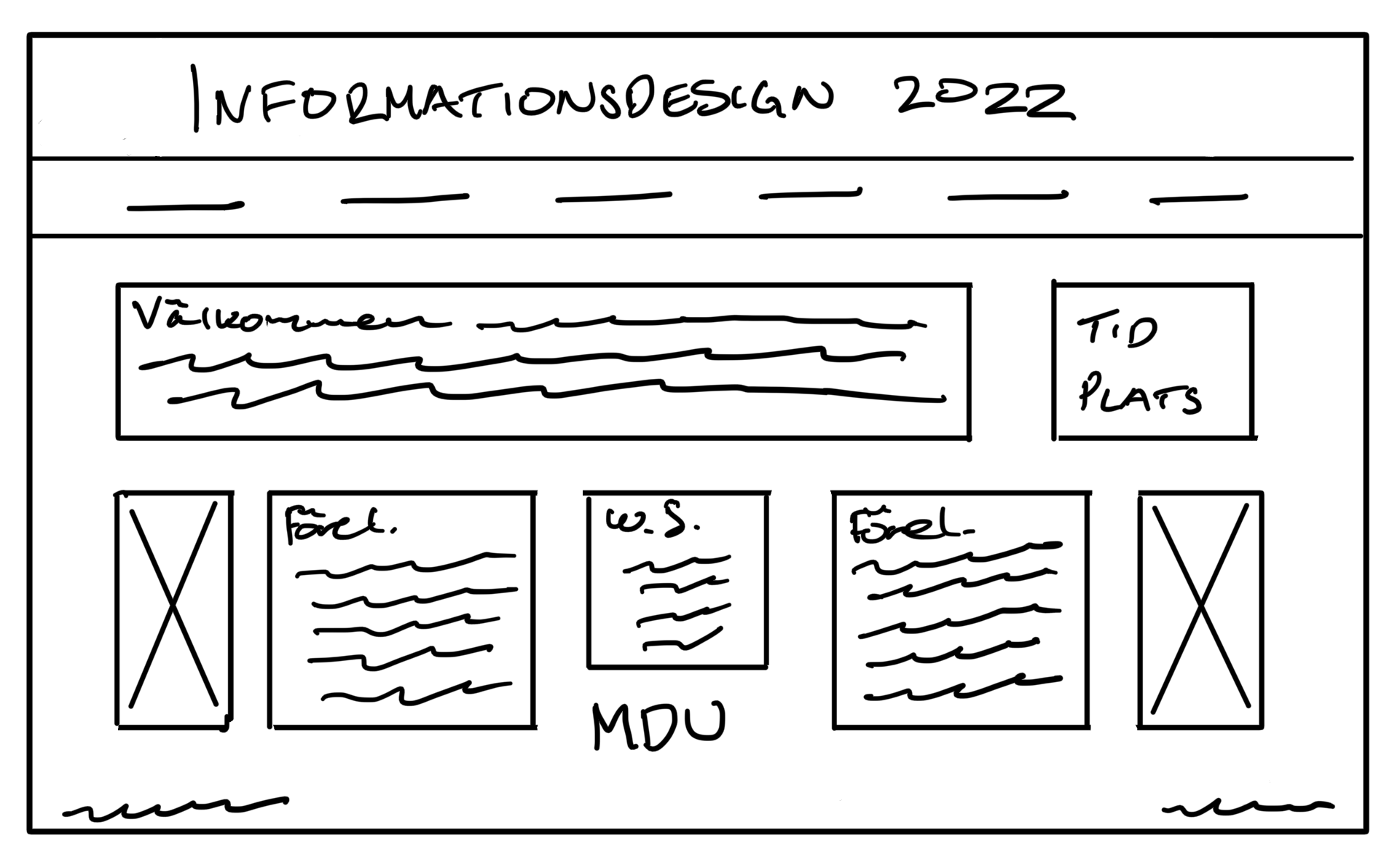
“I think this one is ok, but a little bit boxy. Do the images belong to the texts about the lecturers?”
“It looks fun and playful. It feels a bit unserious maybe. I don’t know where to look first.”
“I don’t know. It looks a bit messy. To many shapes for me.”
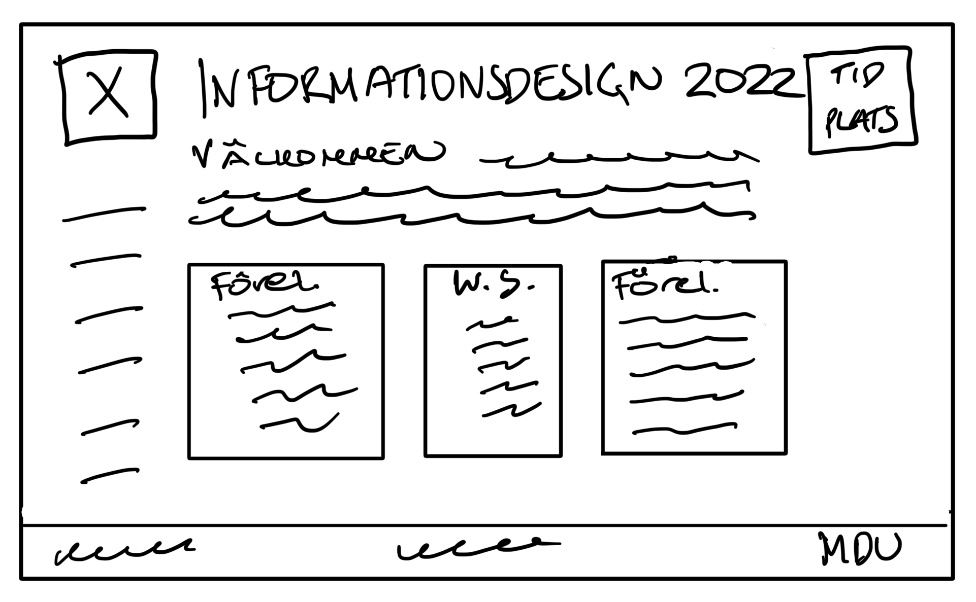
“I like this one. It looks clean and I can easily find all information.”
Wireframing and A/B testing
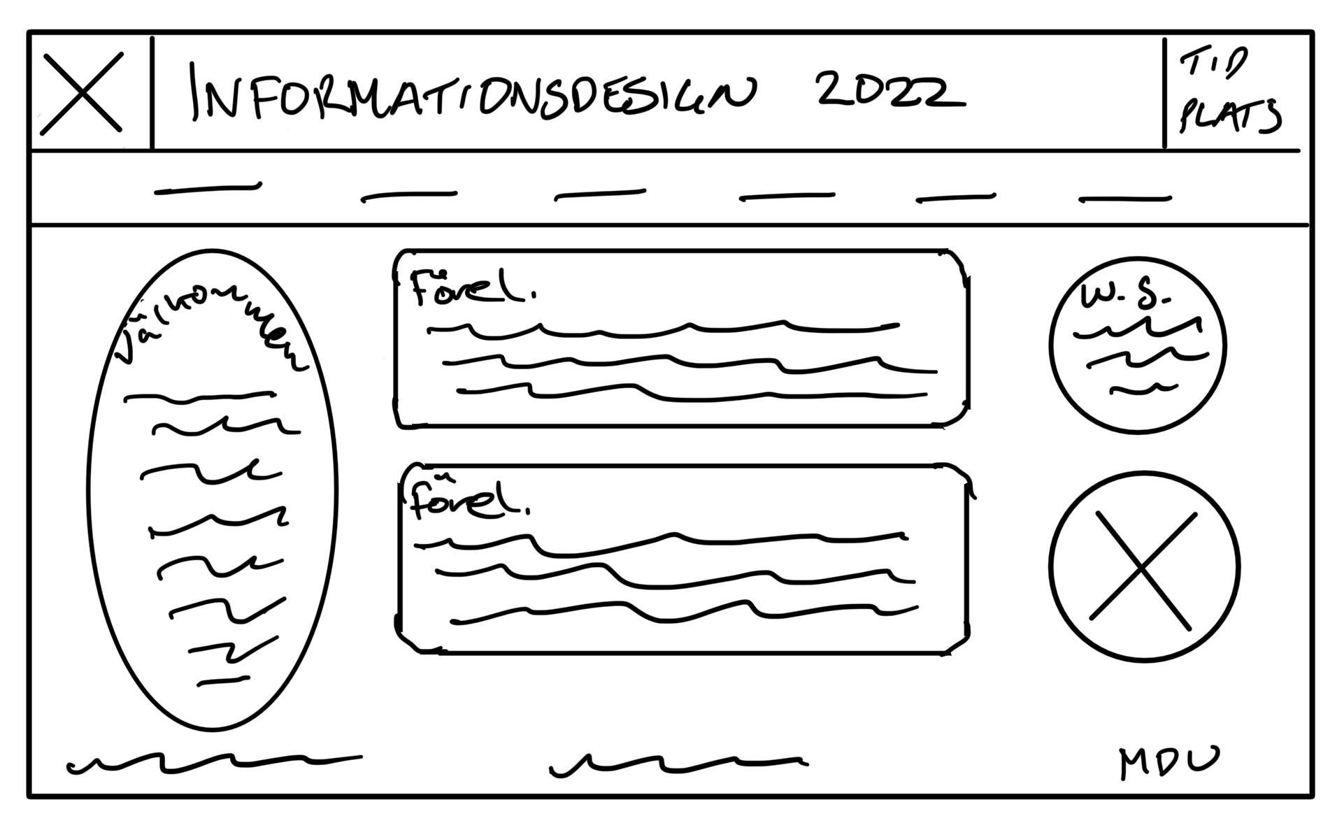
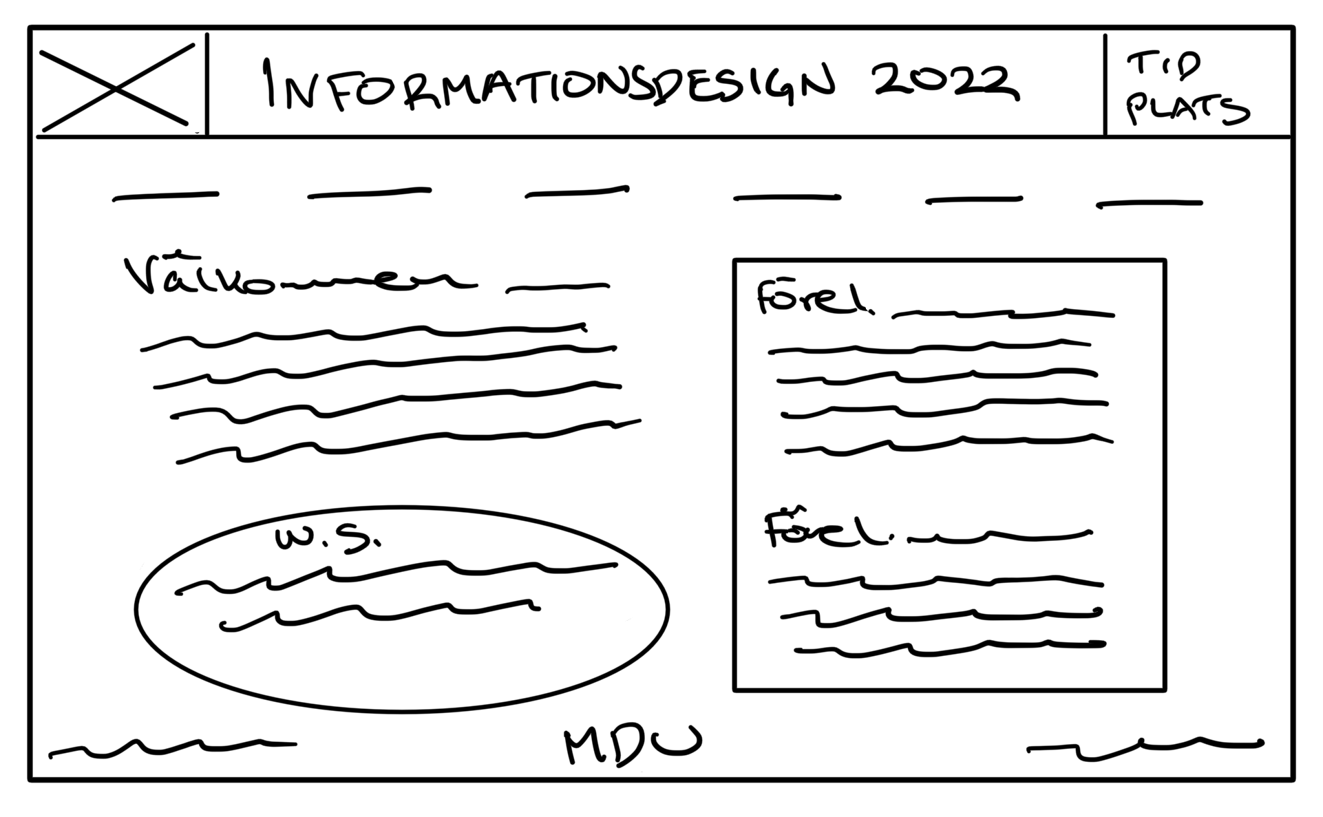
I translated the two most promising directions into wireframes. Clear structure to guide, not impress. Both wireframes were then user tested to decide the next step.

“I like the heading. It has the most important information and I like that the menu bar sort of frames the title.”
“It’s easy to get a quick overview of the page.”

“I like the menu on the side, but I don’t like the circle. It looks off.”
“It’s ok, but it’s missing something in the header. It looks empty there.”
“The preamble seems wide.”
Webflow Building
With one layout chosen, the page was built in Webflow, followed by presentation. Feedback encouraged me to reassess and refine the design.

“I don’t like the background color, It’s too sharp and it doesn’t exactly give me a conference feeling.”
“It’s a bit boxy and I don’t get the picture. It doesn’t seem to match the topic of the conference.”
“I think it’s a little off-balanced. The image takes to much of my focus. I love the background color, but not in this context. What’s it’s relation to information design or MDU?”
Final Iteration
Combined feedback remarks guided the redesign. Not major changes, just enough to make the page more easily scanned and memorable.