The Interface That Wanted More
This is a story about a concept prototype exploring how unconventional layouts can enhance emotion and user engagement through design.
Role: UX and Interaction Designer
Project Length: 4 weeks
Project Overview
This is the short version. Scroll down for the full process.
-
Design an interactive exhibition screen that uses emotional design to let users discover who you are.
The goal: Encourage exploration, spark curiosity, and challenge expectations of how an interface should behave.
-
How do you give an interface agency without losing the user’s trust?
The more personality it had, the more it risked breaking conventions. The challenge was to balance charm and creativity with usability.
-
The project began with cultural probes to inspire early ideas and shape the interface’s personality.
Through guerrilla testing, iteration, Think Aloud protocols, and A/B testing, the design evolved into an experience that balanced curiosity with usability.
-
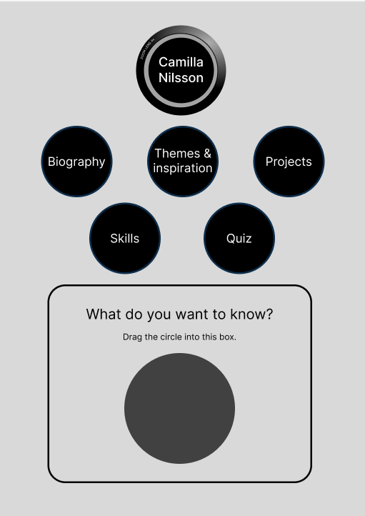
A playful interactive screen that guided users through five areas.
The circular menu gave the interface personality, while testing confirmed that five items felt well balanced.
This structure let the design remain clear and trustworthy while still sparking curiosity and surprise.
-
The final design resulted in an engaging, personality-driven interface that encouraged exploration and sustained user attention.
Users were captivated by the circular menu and repeatedly turned the “wheel”, extending interaction time and deepening engagement.
-
This project reinforced the value of starting broad, testing often, and refining based on real user behaviour.
From cultural probes to the final prototype, every step added clarity to how personality and function can work together.
Creating and distributing a Cultural Probe
I developed a cultural probe in both a physical and a digital format. The probes included tasks encouraging personal interpretation such as:
Question cards promoting exploration and reflection
Either/or cards to explore preferences and decision-making processes
Life priorities ranking to surface deeper values and motivations
A photo challenge to express thoughts visually


Analysis
The probes were returned in very different numbers: all physical versions came back, while only a quarter of the digital ones did.
The content was identical, but the personal delivery of the physical probes made a clear difference.
Physical 100% returned
Digital 25% returned
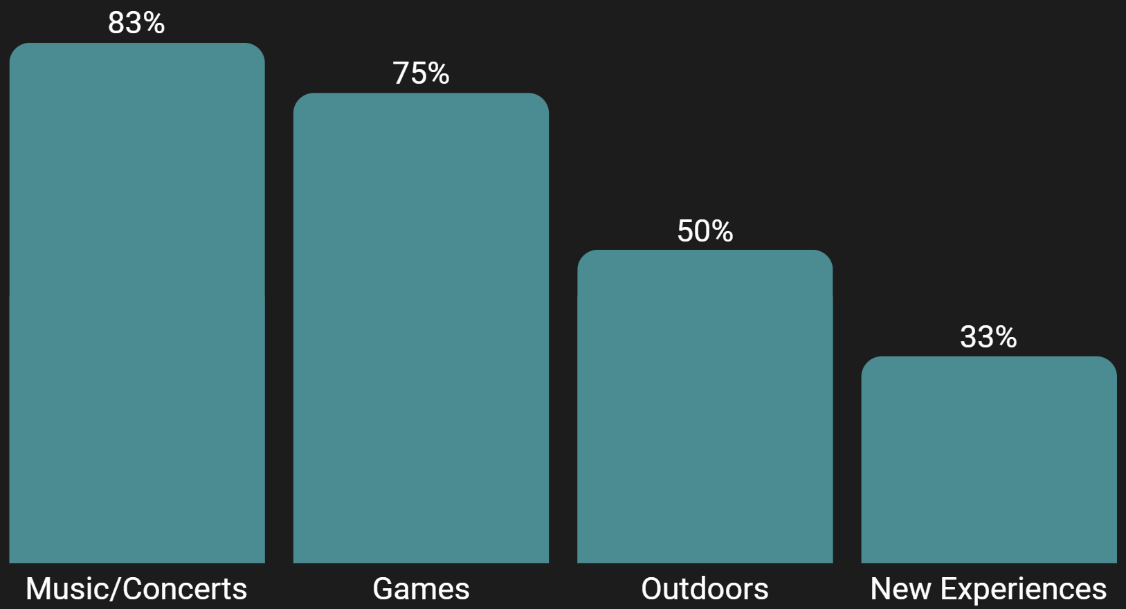
Open-ended tasks revealed clear themes: music, games, outdoor activities, and new experiences. These results highlighted sharing experiences with loved ones as the strongest source of joy.
Designing in Figma
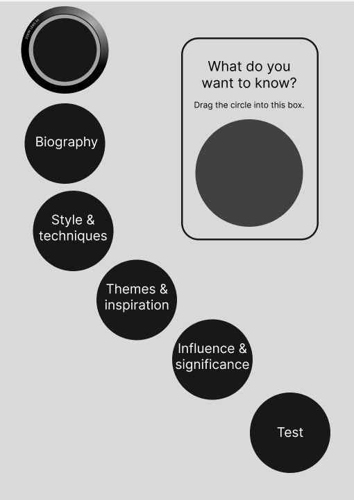
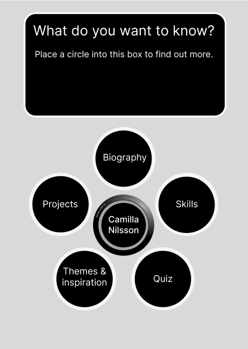
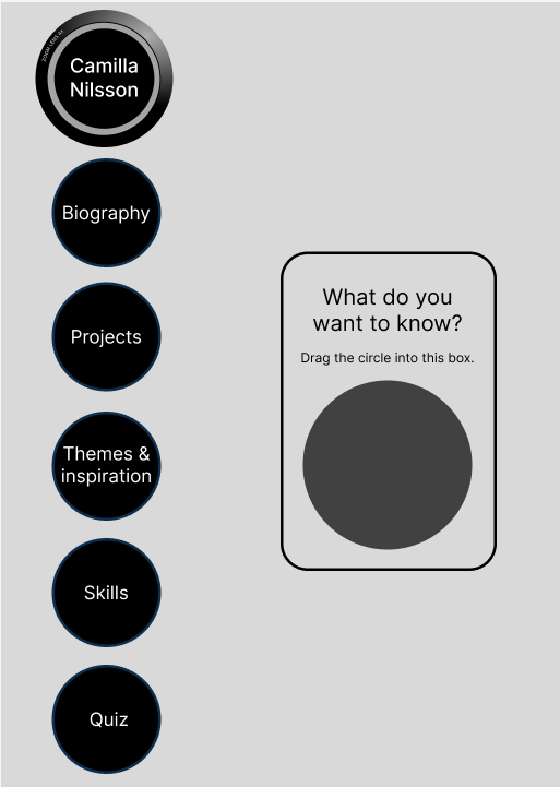
Insights from the probes inspired me to design playful interactions in Figma. While waiting for all responses, I began testing ways of giving users a sense of agency by creating the illusion of movable on-screen objects in Figma.
Refinement of Design Concept and Iterative Testing
Building upon the results of guerilla testing, I proceeded to refine the circular menu system. However, uncertainty surrounded the blue color scheme, prompting me to experiment with various background images and colors. Concurrently, I also conducted experiments with headlines and explored different subjects to determine the focus of the screen.
This comprehensive approach led to further user testing, incorporating Think Aloud protocols and A/B testing methodologies. The outcome was clear - the blue design with me as the subject was preferred, although the headlines remained unclear.

Final design proposal
Final reflections
After an iterative design process with lots of feedback from users, the result was an interactive screen with cohesive design, a touch of humor, and a wow factor.
Above all, this experience has opened my eyes to the immersive potential that Figma holds. I realize that I have only scratched the surface of its capabilities and that there is much more to learn and discover. With each new design project that lies ahead of me, I look forward to pushing my boundaries and letting creativity flow in Figma’s enchanting world.